
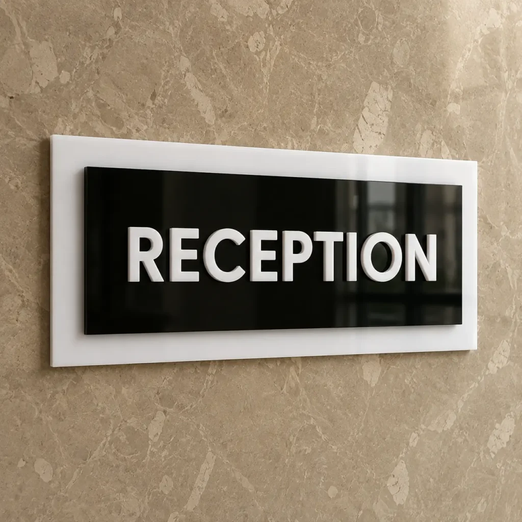
A complete office signage system usually needs more than a reception logo. For a small or medium office, plan signs in five groups: brand/reception signage, room and cabin identification, directional/wayfinding signs, shared-facility signs, and safety or statutory signage. Using one coordinated material, font and colour system makes the workplace easier to navigate and keeps the brand consistent.
This guide is for offices, coworking spaces, professional firms and commercial interiors planning a new fit-out or replacing mismatched signs. Bright N Wall manufactures custom acrylic and layered signs from Ujire, Karnataka, with project enquiries supported across India.
Send Your Office Room List on WhatsApp
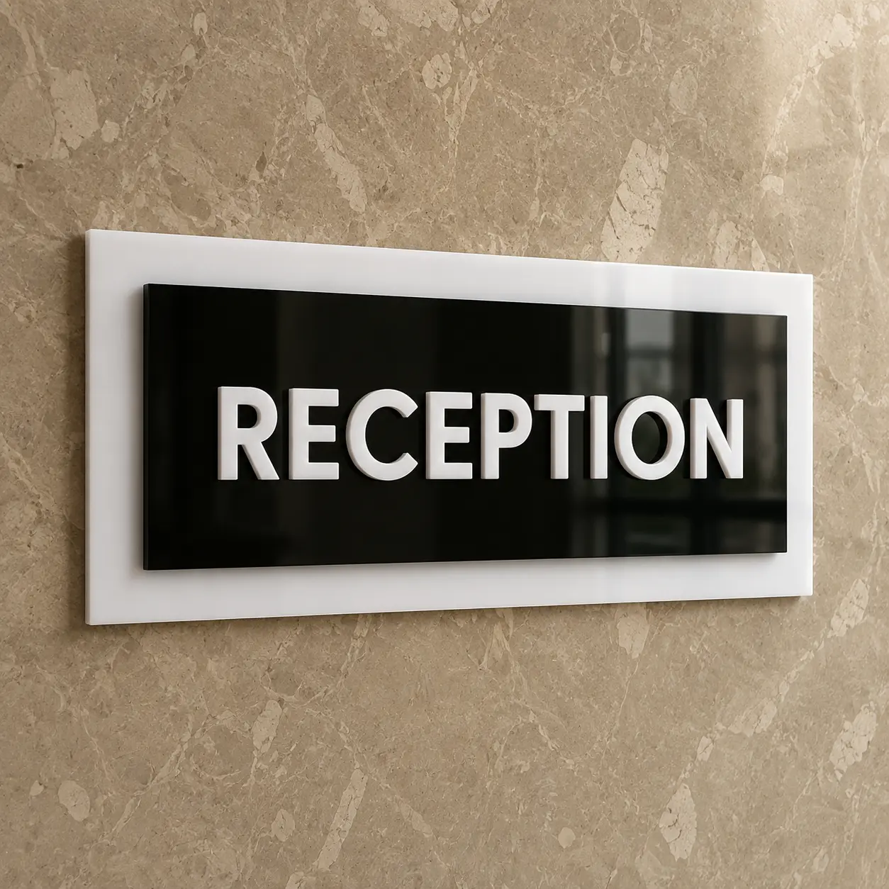
What signs does an office actually need?
Start with the visitor journey. A first-time visitor should be able to identify the company, find reception, reach the correct meeting room or cabin, locate washrooms and exits, and leave without asking for directions at every junction. The exact quantity depends on the floor plan, but the checklist below covers the common sign types.
| Sign type | Typical location | Main purpose | Common Bright N Wall approach |
|---|---|---|---|
| Reception / logo sign | Reception feature wall | Brand identification | Layered acrylic, mirror finish or optional LED |
| Cabin / room sign | Beside or on doors | Identify people and rooms | Acrylic or brushed-finish plaque |
| Meeting / conference room | Meeting-room entrance | Room identification | Layered acrylic sign |
| Directional sign | Corridor junctions and lift lobbies | Guide visitors | High-contrast text and arrows |
| Directory board | Entrance or lift lobby | List departments / rooms | Custom multi-line board |
| Washroom sign | Corridor / washroom entrance | Facility identification | Text + clear pictogram |
| Staff Only / restricted area | Back-office doors | Access information | Compact high-contrast sign |
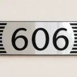
| Room / floor number | Doors and floor entries | Fast identification | Compact acrylic number sign |
| Safety / exit signage | Escape routes and required locations | Safety information | Specify separately to applicable project requirements |
What should the reception sign include?
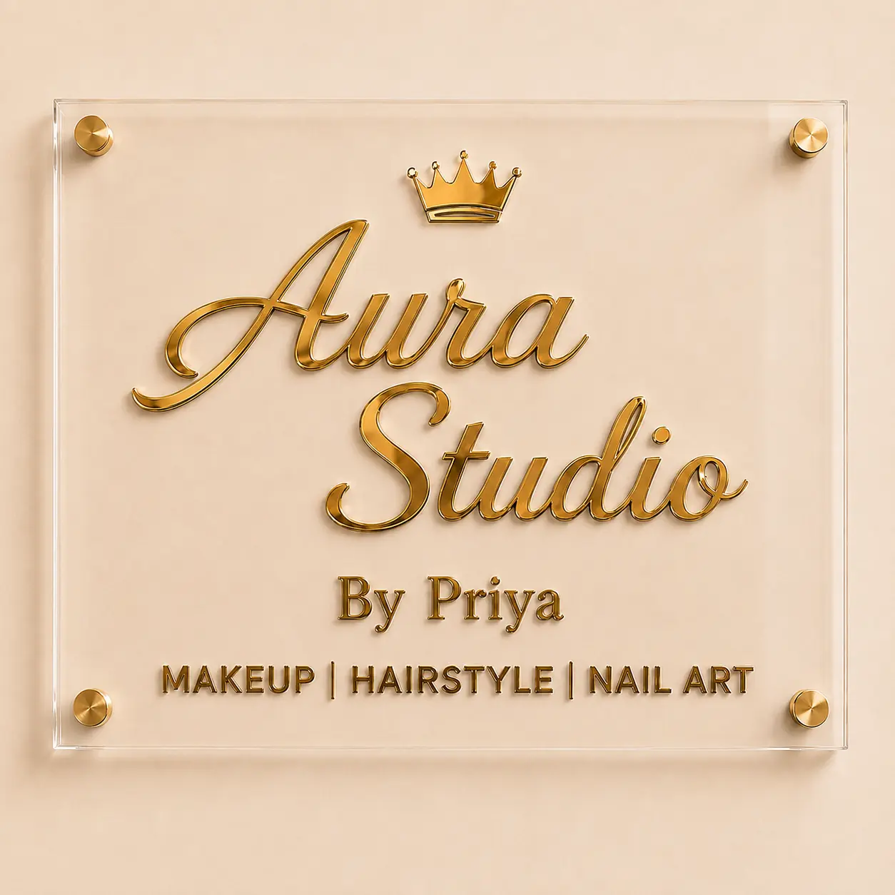
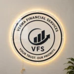
The reception sign should normally carry the company logo or business name, not every service the company offers. Keep taglines secondary so the main brand remains readable from the entrance. For indoor offices, layered acrylic gives crisp edges and controlled depth; mirror-gold or mirror-silver can add a premium accent, while warm backlighting is useful when the wall needs stronger visual presence.
Bright N Wall currently offers a 3-layer acrylic reception sign board and a 7 × 20-inch mirror acrylic reception sign with optional warm LED. For larger branded walls, the logo should be proportioned to the actual wall rather than stretched from a small standard size.
For a detailed cost breakdown, see the reception logo board pricing guide.
Which cabin and meeting-room signs should be planned?
List every enclosed room before production. Common labels include Director, Managing Director, Accounts, HR, Admin, Conference Room, Meeting Room, Training Room, Pantry, Server Room, Store, Staff Only and individual cabin names. If roles or employee names change frequently, avoid permanently engraving changeable information into a large expensive sign; design the system so replaceable parts can be updated.
For a coordinated premium interior, use the same base colour, letter colour, corner treatment and mounting method throughout. Bright N Wall’s office range includes reception, conference-room, staff-only and room-number signs, allowing the visual system to stay consistent instead of mixing unrelated ready-made plates.
Where should directional and wayfinding signs go?
Place directional signs at decision points—locations where a visitor must choose left, right, straight ahead or another floor. Typical positions include lift lobbies, corridor intersections, reception exits and staircase approaches. A sign placed after the junction is too late.
India’s Harmonised Guidelines for barrier-free environments state that directional signs guide people to rooms and facilities and should be located along corridors, elevator lobbies, entrances or staircases. The same guidance stresses clear visibility and proportioning lettering to viewing distance. For accessibility-critical or statutory projects, the project architect or accessibility consultant should confirm the current applicable requirements before fabrication.
How big should office signs be?
There is no single correct size for every office. Size should follow viewing distance, amount of text, wall width and whether the sign is read while standing nearby or walking through a corridor.
| Use | Practical starting format | What to check before ordering |
|---|---|---|
| Cabin / staff door sign | Compact horizontal plaque | Name length, designation, door width |
| Meeting / conference room | Medium horizontal plaque | Reading distance from corridor |
| Room number | Small high-contrast plaque | Number visibility and mounting surface |
| Reception sign | Proportional to feature wall | Wall width, logo aspect ratio, furniture |
| Directional sign | Large enough for moving viewers | Viewing distance, arrow clarity, number of destinations |
| Directory board | Based on number of listings | Future expansion and update method |
As a useful accessibility reference, the Government of India’s Harmonised Guidelines state that room-number and identification signage should be positioned at about 1400 mm from finished floor level to the bottom of the sign, while projecting or ceiling-suspended signs should be above head height at about 2300 mm. Treat these as planning references and verify the requirements that apply to your building and project.
Acrylic, ACP or brushed finish: which material suits an office?
| Material / finish | Best use | Main advantage |
|---|---|---|
| Matte / glossy acrylic | Cabins, meeting rooms, reception | Clean laser-cut finish and strong colour contrast |
| Clear acrylic | Premium reception and professional offices | Floating, light visual appearance |
| Mirror gold / silver acrylic | Logo accents and premium branding | Reflective metallic appearance |
| Brushed gold / silver face | Professional room and desk signage | Softer metallic look with engraving potential |
| ACP | Larger entrance or semi-exposed boards | Stable backing for larger formats |
For indoor cabin and room signs, acrylic is usually the simplest coordinated choice. For a board exposed to rain or direct sun, material selection should be reviewed separately rather than assuming an indoor acrylic specification is suitable. Browse the full Bright N Wall Office Sign Boards collection.
Should office signage be bilingual?
Bilingual signage can be useful where employees, visitors or customers use more than one language. In Karnataka, English + Kannada can be appropriate for visitor-facing signs; other locations may benefit from Hindi, Tamil, Malayalam or another regional language according to the audience and project requirements.
Do not squeeze two languages into a sign designed for one. Allow enough width, keep both scripts readable, and establish a consistent hierarchy across the entire office. Directional arrows and familiar pictograms can reduce dependence on text for common facilities such as washrooms.
What information should you send for an office signage quotation?
The fastest way to get an accurate project quote is to prepare one room list rather than sending signs one at a time. Include the exact wording for every sign, quantity, approximate size or available wall/door area, logo file, preferred colours, indoor/outdoor location, mounting surface and delivery city. Add straight-on photos of the reception wall and any unusual installation surfaces.
For example, a small-office enquiry might include: 1 reception logo, 1 directory, 2 directional signs, 1 conference room, 6 cabin signs, 2 washroom signs, 1 pantry sign and 2 staff/restricted-area signs. Bright N Wall can then quote the group as a coordinated signage project.
What mistakes make an office signage system look inconsistent?
- Ordering each room sign at a different time with unrelated fonts and finishes.
- Using small decorative fonts for corridor wayfinding.
- Putting arrows too close to text or using inconsistent arrow directions.
- Making every sign the same size even when viewing distances are different.
- Using mirror finishes where glare makes small text harder to read.
- Forgetting pantry, washroom, server room, store and restricted-area signs until after installation.
- Engraving frequently changing employee names into permanent large-format signs.
- Starting production before checking spelling, room numbering and final floor-plan names.
Office signage planning checklist before production
Freeze the room list first. Then approve one design system covering font, colours, materials, corner style, icons, mounting and text hierarchy. Check every sign against the floor plan, approve a digital proof, and only then release the full quantity for production. This reduces mismatched signs and replacement costs.
If you are fitting out an office in Bengaluru, Mangaluru, coastal Karnataka or elsewhere in India, share the floor plan or room list early. Larger projects benefit from planning reception branding and internal wayfinding as one system rather than as separate purchases.
Get an Office Signage Project Quote
Frequently asked questions
What are the most important signs for a small office?
Start with the reception or company logo, cabin and meeting-room identification, washroom signs and directional signs at any confusing junctions. Add a directory when several rooms or departments share the same floor.
Which material is best for indoor office door signs?
Acrylic is a practical choice for many indoor offices because it supports crisp text, layered designs and consistent colours. Brushed finishes work well when a metallic professional appearance is preferred.
Can all office signs use the same design?
They should share a visual system, but not necessarily the same dimensions. Reception branding, door signs and corridor directions have different viewing distances and information loads.
Can Bright N Wall make Kannada and English office signs?
Yes. Bilingual layouts can be prepared in Kannada and English, with other regional-language combinations considered according to the project.
Can LED lighting be added to an office reception sign?
Yes. Selected reception and logo signs can use warm LED backlighting. The wall, cable route, power point and desired glow should be confirmed before production.
What should I send for a bulk office signage quote?
Send the logo, complete room/sign list, quantities, wall or door photos, preferred finish, approximate sizes or available spaces, delivery city and whether any signs need lighting.
Related guides: Reception Logo Board Pricing · Clinic Signage Package · Hotel Signage Package · Bulk & Corporate Orders
 House Name Plates
 Office Sign Boards
 PVC Jaali Design
 PVC Roof Borders
 PVC Gable Jaali
 Corporate Gifts
 Wall Art
 Wall Clocks
 Number Plates
 Diwali Decorations
 Shelves & Storage