

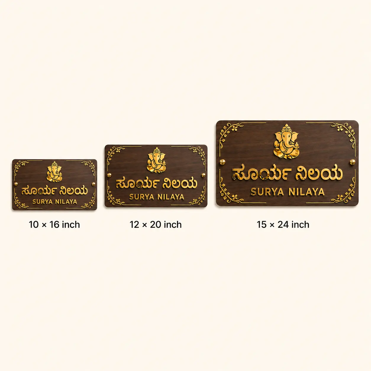
For a bilingual Kannada and English name plate, readability comes from hierarchy—not from making both languages equally large. Keep the primary house or family name dominant, use medium-to-bold Kannada strokes, give vowel signs and conjuncts enough space, and choose strong contrast such as mirror gold on walnut or white on black. For many entrances, 10×16 to 12×20 inches gives a bilingual layout enough breathing room; larger 15×24-inch formats suit villas, longer names and richer motifs.
This guide focuses on the practical design decisions that matter before production: Kannada font weight, English pairing, letter spacing, board size, material, viewing distance and proof approval.
Get a Free Kannada + English Design on WhatsApp

What makes a Kannada and English name plate easy to read?
The four biggest factors are font stroke thickness, contrast, text hierarchy and viewing distance. Decorative details should support the name rather than compete with it. Thin calligraphy can look elegant on a screen but may lose clarity after laser cutting or when viewed from a gate.
| Design decision | Better choice | Common mistake |
|---|---|---|
| Kannada font | Medium/bold strokes with open counters | Very thin or tightly packed calligraphy |
| English font | Simple serif or clean sans-serif that complements Kannada | Two highly decorative fonts competing |
| Contrast | Gold/white on dark base or dark text on light base | Similar-tone letters and background |
| Hierarchy | One primary name, secondary language slightly smaller | Every line at the same visual weight |
| Spacing | Comfortable gaps around Kannada vowel signs and symbols | Crowding text to fit a board that is too small |
How should Kannada and English be arranged?
There is no single correct order. If Kannada is the family’s primary language, make the Kannada name the first or strongest line and use English as the secondary line. If delivery visibility or mixed-language visitors are a priority, the English line can remain clearly readable without overpowering the Kannada identity.
A useful rule is to keep one clear focal line. Door number, subtitle, family surname and devotional motif should be subordinate. For longer Kannada names, increasing the board width is usually better than compressing the type.
What size is best for a bilingual name plate?
| Typical use | Suggested size range | Best for |
|---|---|---|
| Apartment / short name | 7×16 to 10×16 in | Two concise lines, limited motif |
| House entrance | 10×18 to 12×20 in | Kannada + English, house number and a small symbol |
| Villa / longer family name | 15×24 in or larger | Longer text, richer motif and greater viewing distance |
These are starting points, not rigid standards. Measure the usable wall or door area and consider where a visitor first sees the plate. A name plate at an apartment door can use smaller letters than a plate expected to be read from a driveway or gate.
Which font style works best for Kannada laser-cut letters?
Choose a Kannada font with strokes thick enough to manufacture cleanly at the final size. Pay special attention to vowel signs, conjunct characters and narrow bridges. The smallest detail in the font—not the largest letter—often determines whether a design is production-friendly.
For English, a restrained serif or sans-serif usually pairs better with Kannada than a second ornate script. Before production, always review the design at the actual physical size, not only as a zoomed phone preview.
Which material gives the best contrast?
For a warm premium entrance, walnut-finish ACP with raised mirror-gold acrylic creates strong separation between the base and lettering. Matte black with mirror gold gives an even bolder contemporary contrast. White or frosted acrylic can work well when the entrance itself is dark.
For outdoor selection, exposure matters as much as appearance. See Bright N Wall’s outdoor name plate material comparison before choosing a finish for a rain-exposed wall or gate.
Real Bright N Wall bilingual Kannada + English examples
Ganapati Walnut ACP Name Plate
The Premium Kannada & English Ganapati Walnut ACP House Name Plate uses a 3 mm walnut-finish ACP base with 3 mm raised mirror-gold acrylic. It is offered in 10×16, 12×20 and 15×24-inch sizes with two stud mounts. This format works well when the bilingual text is paired with a devotional symbol without making the board feel crowded.

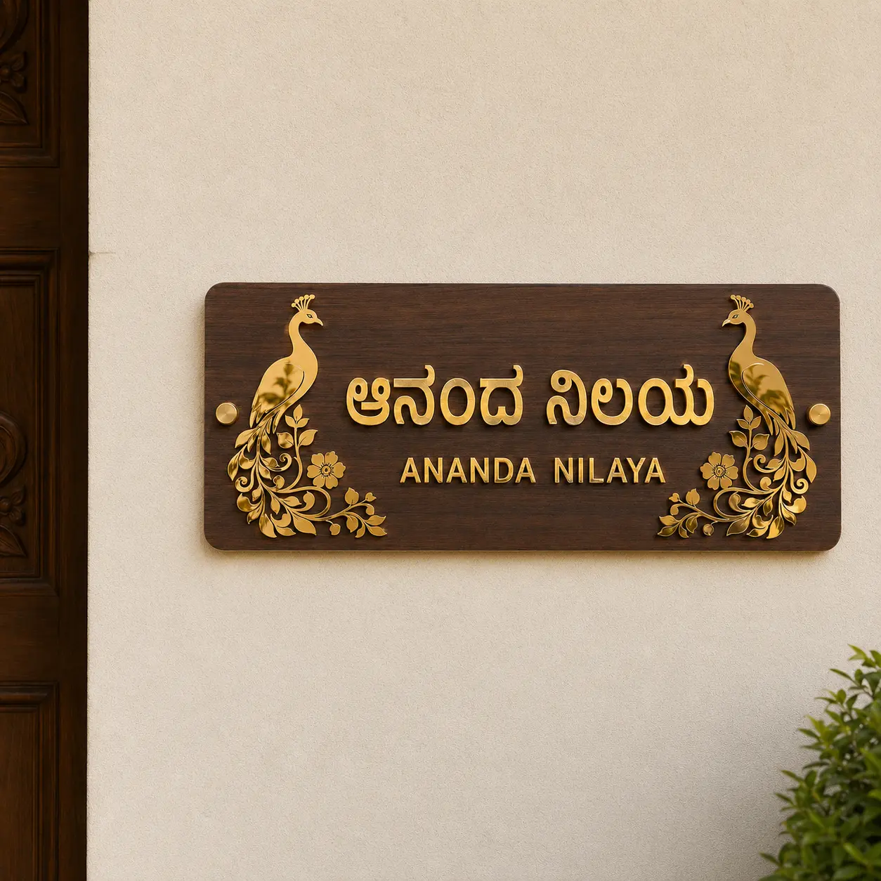
Peacock Walnut ACP Name Plate
The Premium Kannada & English Peacock Walnut ACP House Name Plate uses the same 3 mm walnut ACP and 3 mm mirror-gold acrylic construction in narrower 7×16 and 9×20-inch formats. It suits shorter names where decorative peacock details can remain visually separate from the text.
How do you check Kannada spelling before manufacturing?
Check every character in the final design preview, including vowel signs, conjuncts, punctuation, spacing and line breaks. Do not approve only from a typed message: the exact rendered font should be checked. If possible, have a Kannada reader in the family verify the proof as well.
Also confirm whether the English line is a transliteration of the Kannada name or a different wording. This avoids a visually correct design containing inconsistent names.
Should the house number be in Kannada, English or both?
For practical identification, Arabic numerals such as 108 or 302 are widely readable and can remain a clear secondary element. If you want Kannada numerals or bilingual numbering for cultural preference, keep the number distinct from the family name and avoid adding so many elements that the main text becomes small.
What should you send before requesting a design?
- Exact Kannada spelling
- Exact English spelling or transliteration
- House/door number
- Approximate available wall width and height
- A straight photo of the entrance
- Preferred material or colour combination
- Whether Kannada or English should be visually dominant
Bright N Wall can then prepare a design preview so the wording, proportions and manufacturing details can be checked before production.
Send Your Kannada + English Text on WhatsApp
Frequently asked questions
Which font is best for a Kannada house name plate?
A medium or bold Kannada font with clear character shapes is usually the safest choice. Avoid very thin strokes and cramped decorative forms, especially on small boards.
Can Kannada and English be used on the same name plate?
Yes. A bilingual layout works best when one language is visually primary and the second is slightly smaller, with enough spacing to keep both easy to read.
What size should a Kannada and English name plate be?
For many home entrances, 10×16 to 12×20 inches is a useful starting range. Longer names, villa entrances and greater viewing distances may benefit from 15×24 inches or larger.
Is mirror-gold acrylic readable outdoors?
It can provide strong contrast on dark or walnut backgrounds, but it is reflective, so appearance changes with light and viewing angle. Keep the lettering sufficiently bold and the background clearly different in tone.
Can I add Ganapati or another devotional symbol?
Yes. Keep the symbol secondary to the name and allow enough empty space around both so the bilingual text remains the main readable element.
Do I get a Kannada spelling preview before production?
Bright N Wall provides a digital design preview before production. Check every Kannada character, English spelling, number and line break before approving it.
Related guides: Kannada Name Plate Designs for Home · Name Plate Size Guide for Apartment Doors · 3M Tape vs Stud Installation · Acrylic & Mirror Gold Care Guide
 House Name Plates
 Office Sign Boards
 PVC Jaali Design
 PVC Roof Borders
 PVC Gable Jaali
 Corporate Gifts
 Wall Art
 Wall Clocks
 Number Plates
 Diwali Decorations
 Shelves & Storage